
A Beginner’s Guide to Logo Design | Branding Lessons from Kulhar & Bean
Kulhar & Bean branding project has been selected for nomination in an upcoming international design awards program and will be featured among the Best Designs on DesignRush .
Designing your logo can be a challenge, especially when you’re trying to stand out in a crowded and competitive market.
Whether you’re a design student, a beginner graphic designer, or a small business owner building your first brand.
Let's walk through the fundamentals of designing a logo that communicate and connect your consumers.
Understand the Brand Story Before You Design: Ask the "Why"
Every successful logo starts with a clear brand story. Convey the story. Imprint the brand’s name.
As one of the greatest creative truths reminds us,
“The greatest thing you have working for you is not the photo you take or the picture you paint — it’s the imagination of the consumer. They have no budget, they have no time limit, and if you can get in that space, your ad can run all day.”
Before sketching a single shape, it’s important to define:
- Who the brand is for
- What the brand stands for
- How the brand should feel emotionally
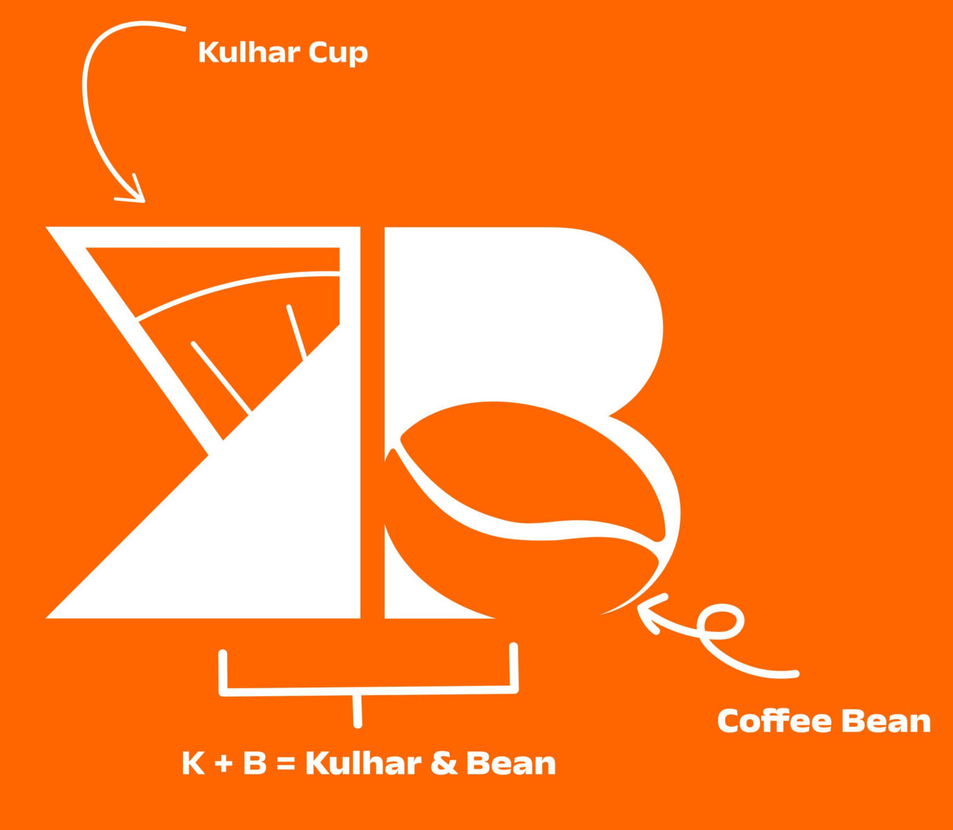
The goal here was to build a café brand identity that blends Indian heritage with contemporary café aesthetics, creating a warm, welcoming brand that feels globally inspired and locally rooted.
Research Your Competitors and Find Your "Limelight"
Learning how to stand out from competitors is one of the most important branding lessons for beginners.
Instead of copying or blending in with the industry, a Blue Ocean branding strategy — focusing on differentiation rather than competition.
- Use storytelling instead of generic icons
- Create something that combines meaning and simplicity
This approach shows how strategic brand positioning and visual differentiation can help new brands avoid crowded design spaces and build stronger emotional connections.
👈 Take a sneak peek into the ad we created, inspired by one of the greatest advertising campaigns — Red Bull’s animated ads.
Typography and Colors = Brand personality and Identity
Typography and color create a consistent visual language that strengthens brand recognition and builds emotional connection across every touchpoint.
For this project, the primary typeface chosen was Anek Devanagari. Alongside typography, the color palette was inspired by traditional terracotta and warm spices, forming a system that communicates warmth, authenticity, and balance:
- Kulhar Orange (#FF6600) – warmth, energy, cultural depth
- Creamy White (#FFFFFF) – clarity, minimalism, contrast
Recognition from the Global Design Community
- Logos & brand identities
- Creatives & Commercials
- Media strategies